Showing posts with label Winslow Homer. Show all posts


The talk given by Ellen Lippert, which was titled “Winslow Homer: Saga and Salesman” provided a unique angle about the artist whose wood engravings are on the current exhibition at Hoyt Institute of Art. All prints are loaned from Butler Museum of American Art, whose collections have time and again amazed me by its breadth and depth. (Who would expect a town losing more than 50% of its population still holds a world-class museum?)

In general, wood engravings may not be eye-catching if they are placed in prestigious museums. Not only do they lack color, but also they are not original drawings. Based on conservation standards, prints can usually be displayed under light for no more than fourteen weeks before they are sent back to the dark storage rooms. Therefore it is actually very rare to see a comprehensive collection of Homer’s engravings displayed in one instalation.

Although Homer quit working as an illustrator in 1870’s and never went back, those engravings (made by someone else) covered quite a time span of his career. There are works as early as the civil war era and some date to the late 1870’s (such as “breeze up”). But the works done for the Harper’s Weekly highlights the exhibition. After all these works were done by Winslow Homer who came out of the Bufford’s workshop with fine lines that are quintessential to a wood block artist.

Some early double-paged prints seem to be directly detached from the magazine so that some have holes in the middle while others bear visible creases and wrinkles. Additional new copies of the magazine contents are displayed beside those prints. But looking through those wood engravings from Harper’s Weekly, one can easily feel unimpressed. Those B&W pictures are far away from his powerful Proust’s Neck crushing wave scenes. They were strict in both techniques and subjects; the figure drawings are more primitive and tightly controlled. (His late marine paintings, in contrast, grow into their own world.)

But a close examination of the works shows the opposite: In my mind, such a unique experience as a frontline illustrator defined Homer as a painter.

In the first place, viewers are naturally drawn into the contents of the pictures. Homer didn’t beautify or glorify the war and the soldiers. He did depict the battle scenes: A Bayonet Charge was one of the most disturbing drawings of all, in which soldiers from both sides, running out of the bullets, fighting as close to the enemy as to death. But most were not. It could be because of the propaganda purpose, or censorship burden; however, no matter for what reason behind it he added a glow of humanity for the soldiers. In “A Card Game”, there was a Bruegelian merrymaking atmosphere, even though viewers know there must be some grin battle looming ahead of the short feast. “Sleeping on their Arms”, was published in 1864, but no victory could be sensed. Instead the harshness was suffused into the winter scene. Sleeping soldiers were tired, so were the few on duty. However, the comradeship sparked out of the bald trees and bare sleeping ground. Above all, Homer focused on the soldiers who underwent the crudeness and threatening that readers stayed back could not imagine.

Those pictures provided no clue that his later style would be from the content perspective. Throughout his career, Homer was gradually drawn to the mighty nature that eventually all human were obliterated from his paintings. For him, moon, rocks and waves provided enough dramas for a soul of solitude. However, as a painter, Homer’s growth was more linear than disruptive. If one can move away from what was drawn in the picture and focus on how they were drawn instead, he can easily feel the linkage among his paintings: the design.

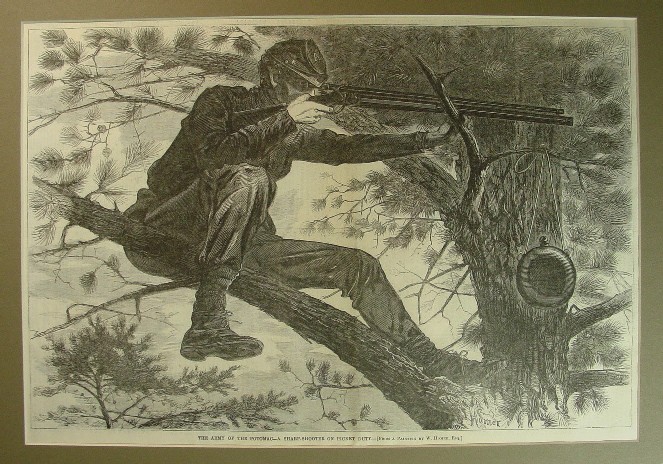
Several of Homer’s late works bears remarkable directness no matter what the subjects are. In “After the Hurricane”, the slightly tilted human figures were isolated from the sea by the wreck. There were no devastating nature scenes, but the image was effectively narrative by Homer’s choice of the boat which was placed with the opposite diagonal angle and his choice of body gesture which recalls classical reclining figures. The relative close distance brings up both dignity and sorrow from the tragedy. In “Right and Left”, viewers witness the process of the death from the two ducks. Such closeness can be valid only if viewers take the imaginary duck’s point of view, thus Homer brings down the viewer into the action. Then the hunter, no matter how small he has been drawn, takes the substantial meaning to balance the picture. Even in those Proust’s Neck pictures, the directness and boldness of paint brush cannot disguise his marvelous composition which is at once both natural and authoritative. Back to those civil War pictures, the soldiers were drawn in groups and forms of human figures gave away to more important overall composition. In most cases, he brought up the view closer so that there was a strong sense of narrative. Although he used lines succinctly and efficiently, he gave great detail to the center of the story and used airy perspective to render the background if necessary. No other early works than his most successful drawing “The Sharpshooter” could more effectively demonstrate Homer’s consistency as a designer. Here, we see the sniper from the bird angle, just like how we perceive those ducks. In both cases, Homer chose the perspective that were the most impossible yet the most narrative. High in the air, we observe of the sniper, in silence and in awe and expect the inescapable death execution, which he painted again more than 40 years later.

Secondly, although there was no record of how close Homer were to the battle scene, no one could walk out of the most bloodiest war in history without being changed. Civil War was the last war in history that infantry still marched out of the trench toward the enemy and the casualty lined up with every step they made. At the same time, the long-distance weapon was also first brought up to the military so that battle killing can be as remote and cold-blooded as murder. Homer’s “The Sharpshooter” differs from the rest in that here the soldier was drawn with a machine-like coldness. He can be observed, but not approached. He can be drawn, but not depicted. The gun, the half-shaded face showed a moment of deadly silence. Almost out of nowhere, now human can be killed without blood-shed or desperate cry's. Life has never become more fragile than ever before.

After the civil war, Homer’s ostensible subjects changed: soldiers became peasants or fishermen. But the nature didn’t grow more amenable. Instead, it still keeps its mighty power, as deadly as the rifle in the sharpshooter. Against this rugged nature, those ordinary people bear the same reticence and solitude as those soldiers. They are unnamed, uncharacterized, and unassuming, because in front of the unconquerable nature, the fragile humans struggle.

No classical, allegorical or historical topics interested Winslow Homer. Instead he chose the unpredictable commune between human and nature. Death or the hint of death (such as in “Saved” or “The Wreck”), which Homer may have witnessed as early as in war period, surfaced time and again in his paintings. In those paintings, the human beings, no matter how mundane, are depicted as hard-working, taciturn and serious in spite of all foul or malicious may happen ahead. He is now regarded as one of the most authentic American painters. And he deserves it.

Delicious Bookmark this on Delicious

January 8 - February 29, 2008

Main Galleries: Winslow Homer: The Illustrator (1857-1888)
Explore Winslow Homer’s career as a commercial illustrator. Supported by a grant from the National Endowment for the Arts.

Opening Reception: Sunday, January 13 from 2-4 pm

Also the website has a booklet about the artist in pdf format.
http://www.hoytartcenter.org/pdf/Homer.pdf

Delicious Bookmark this on Delicious

The current special exhibition at Carnegie Museum of Art provides a rare opportunity to view 75 American drawing and watercolors collected by the first director of Carnegie Institute of Art (John Beatty) during the first two decades of the 20th century. Based on a museum conservator’s comment, ideally paper works should not be exposed under light for more than 16 weeks per year, thus such treasure has never be integrated into the permanent collection in the museum. Among them, there are works by Winslow Homer, James McNeill Whistler, William Glackens, and Frederick Childe Hassam.

The works by Childe Hassam are mostly pencil and ink drawing. He chose different types of paper to provide the prime color for each work: some brown, some black and of course some white. The effect in general is bold and almost graphically decorative. In particular, he took advantage of the inherent contrast between ink and colored paper to emphasize light and shadow: some more protruding, some more coherent, depending on the similarity between color tones.

Homer started his career as an illustrator for Harper’s weekly. His pencil drawings are quite unique and interesting. But in my mind, it is his water-colors that should be valued the most since they have not been equaled ever since. In the current exhibition, the rare occasion provides two works of his famous theme: Proust’s Neck: one in pencil drawing and one in water-color. Both are efficient and foreboding. The water-color, eliminating the view of sea, projects the anxiety of waiting by carefully scaling the people with the nature. In contrast, the pencil drawing is more economical. He did not try to convert the value of colors into black and white, thus the figures in the drawing are exposed to a world rawer and barer.

It surprised me that Frederick Church sketched two mermaids holding a skull, something that is beyond the scope of accuracy and clarity that he’s familiar with. On the other hand, it does make sense that it was the painter who sketched the unseen and magical, endured all the inconvenience and sufferings to paint exotic scenes of both Arctic and South America.

Thomas Moran’s fondness of light effect is obvious on his only drawing in the exhibition. On the same wall, a pencil drawing of trees by Sanford Gifford bears the distinctive hazy and suffuse characteristics.

Lastly, a work by John Beatty’s contemporary and friend Alfred S. Wall also surprised me. As one of the initial trustees to the Carnegie Institute, his oil works are displayed at both Carnegie Museum of Art and Westmoreland Museum of Art. Among Wall family, I like A. S. Wall the most. William Coventry Wall is too meticulous and controlled while A. Bryan Wall is loose in paint brush while tight in subjects. The scene of Western Pennsylvania under A. S. Wall is mundane, un-idealized. It is not totally untamed, yet not luminous or sensational either. Instead, in that small picture on the middle of the wall, Wall painted the diminishing scene of uncultivated nature with traces of human beings, and infused them with a sense of nostalgia.


Such scene may be forever gone in the current Pittsburgh metro area, but through the carefully preserved artworks it can be still be imagined and appreciated, until Oct 7, when they are put back into storage.

Delicious Bookmark this on Delicious


The current special exhibition of Carnegie Museum of Art, on one hand, shows the depth of its permanent collection, on the other hand reflects the somewhat disoriented organization of the institution.

The current exhibition, "Masters of American Drawings and Watercolors" features works by Winslow Homer, James McNeil Whistler, Child Hassam, and others. In the present day, museums seldom treat art works in paper with as much weight as oil paintings; yet for Winslow Homer, it is shameful to put those water color works of his Prout's Neck period (currently part of the special exhibition) into storage. Simply put: no other American artists have ever equaled Homer in water color. And works around Prout's Neck of Maine coast are particularly unforgettable. The crashing waves convey the same feelings as in those water color works with yellowish skies or faceless figures: a prudish, almost stoic solitude and objectivity of New Englanders.

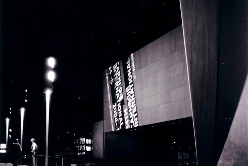
In the permanent collection galleries, another work by Homer stands alone. "The Wreck" won the medal for the first Carnegie International Exhibition in 1896. It would be much better if it were displayed with " Watching from the Cliffs" from the special exhibition. They compliment each other and explain what a story Homer is telling: solitude of human beings confronted by the harsh nature, yet restrained in color and sentimentality.

If it is acceptable to separate Homer's works because of limited display space, then it would be perplexing to find out that William Coventry Wall's works are displayed in different rooms. Not many museums have the luxury of say the Met to have a room designated for an artist such as John Singer Sargent or to own five works by Vermeer. How to display works from different painters in one room can be tricky, however, the Carnegie Museum of Art is the only one I have seen to strictly display works based on chronology.

I agree with Sister Wendy when she says that art does not get better, it just gets different. Displaying art work chronologically is the most seemingly logic, yet the most unrealistic way if styles and schools are not differentiated.

The effect, from a visitor's point of view, is that the only thing that is consistent in display is its inconsistency. On one wall, works by Alfred Sisley (typical Impressionism landscape) , Adolphe Bouguereau (" Souvenir"), Frederich Church (a small-scale arctic iceberg painting) and George Hetzel ("Forest Brook" etc.) were packed together just because they were from the same period—all displayed as if they were in a Victorian parlor, stacked like bricks. Viewing these paintings in this manner only provides visitors one notion: art exists in diversity, but how to link them is lost on all but the well-versed art afficianado.

In the Greensburg Museum of American Art or the Butler Museum of Art, both of which are smaller than Carnegie Museum of Art, works are grouped by styles or topics. In the latter museums, landscape paintings of 19 th century are displayed together loosely in a chronological way with focus on Hudson River School painters. It makes sense that in the end there stand a more romanticized work by Thomas Moran, and a soft abstract work of George Inness, both of which paid tribute to earlier Luminism artists.

But in Carnegie Museum of Art, the name of the rooms are usually marked something like "European and American Art from 18** to 18**". The words "European Art" are just too broad and ambitious to fit into one room. British landscape works by John Constable (the one which is displayed does not do justice to the fame of the artist) and later Benjamin William Leader are different from that from German school saying Caspar David Friedrich who is such an important figure yet not included in the display.

Another interesting observation is that the museum is still having a hard time positioning itself in the balance and breadth of collection, nationalism and depth of local artists. It would be much better to display Scalp Level artists together and show how the detailed style of William Coventry Wall contrasts with his Nephew Alfred Bryan Wall's more painterly style in his typical sheep paintings. It is also illuminating to show how the beautiful rural nature of Western Pennsylvania area migrates into an industrialization giant, as vividly shown from forest scene by George Hetzel to paintings about notorious fire in Pittsburgh which brought financial success for William Coventry Wall, to Aaron Harry Gorson's explosive paintings of steel mills at night.

It was when I saw "Panther Hollow" by John Kane that I feel the impulse and urgency that the whole galleries should be re-prioritized and re-arranged. It is true that the images of Panther Hollow did bring a certain intimacy associated with a city that I love more and more each day, yet displaying seven works by John Kane, a local self-taught artist, while archiving works by Winslow Homer is an idea too provincial to be regarded as an honorable tribute to Pittsburgh.

Delicious Bookmark this on Delicious